Designer’s note: The goal of this project was to design a short film noir, comic/graphic narrative that exposed audiences to and promotes an originally created typeface, one that I have titled “constellations”.

TYPEFACE IDEATION
The typeface portion of the project was approached with the construct of utilizing stars, as I found they embodied the noir theme of contrast between light and dark and had the most potential for a developing typeface.
Noir style is all about manipulating design to bring some source of light out of the dark; a bold contrast. I felt stars very much encapsulated this idea in the sense that stars shine the brightest in complete darkness– unpolluted by city lights and other societal disconnects.
The following image is a poster demonstrating the typeface that was developed.
INSPIRATION IMAGERY AND VISUALS
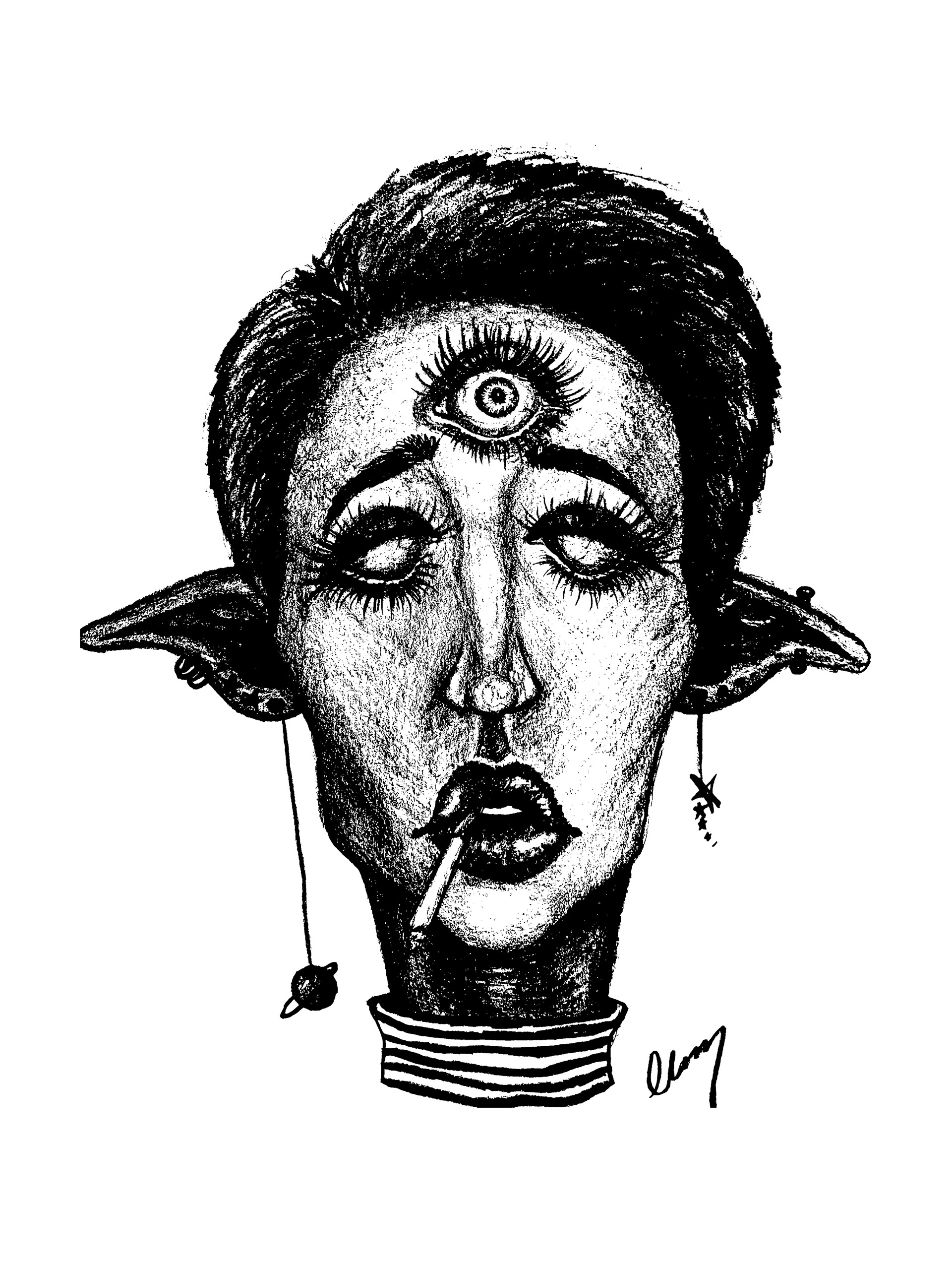
The following images are previous inspirations and ideas of where I wanted to take this noir narrative in an engaging manner.
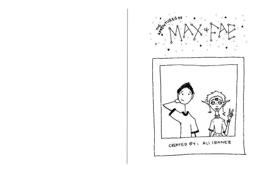
ZINE NARRATIVE AND PROMOTIONAL TYPEFACE
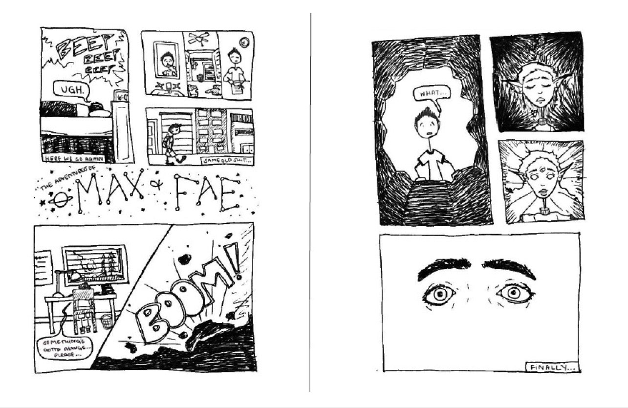
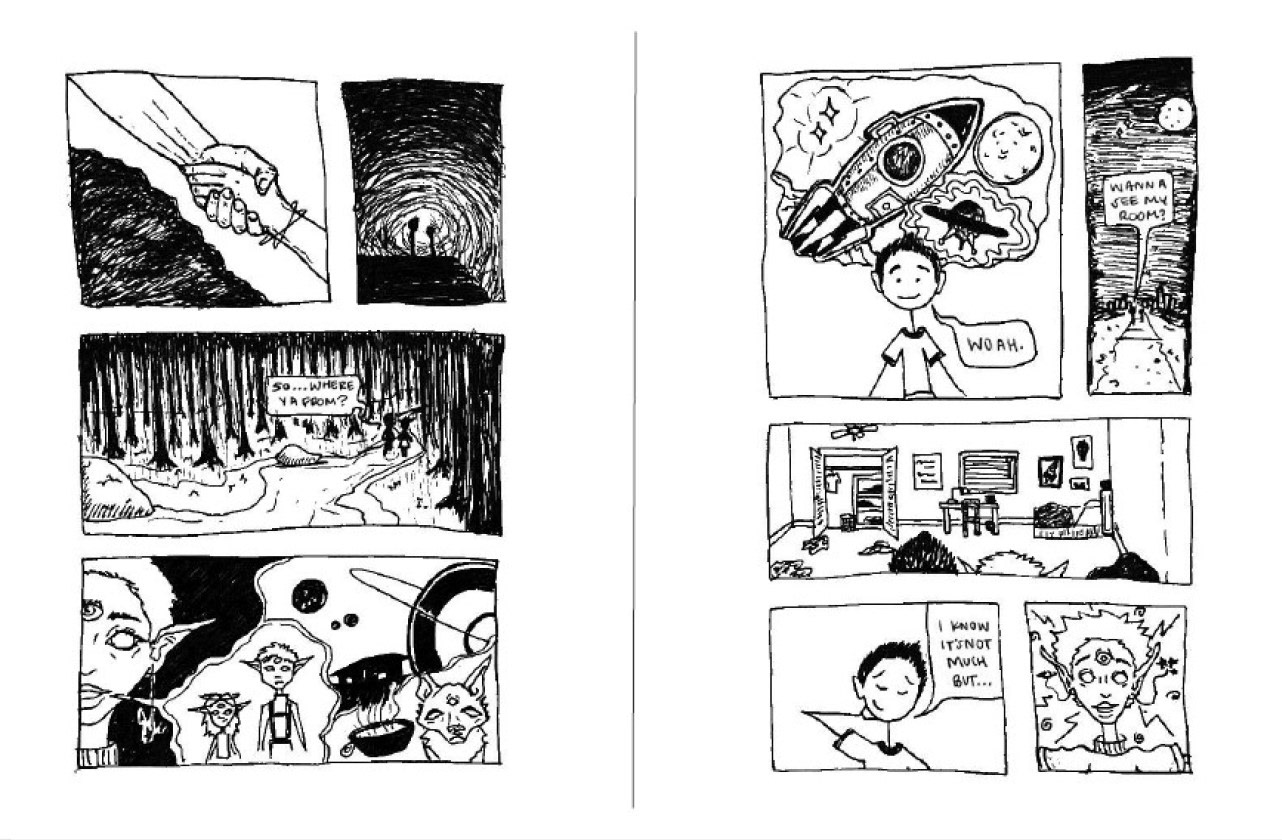
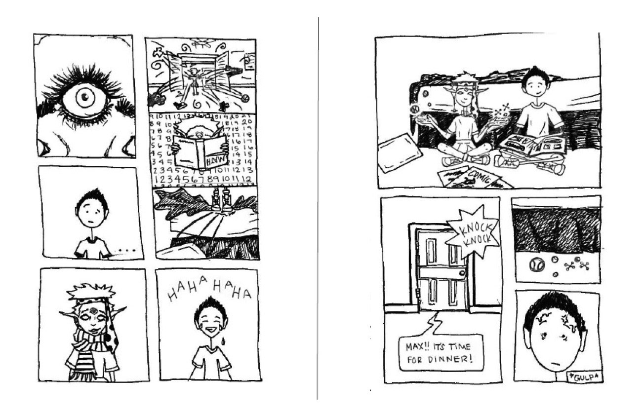
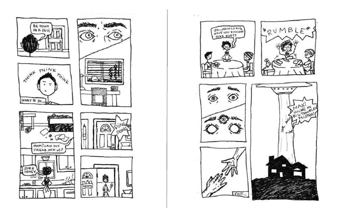
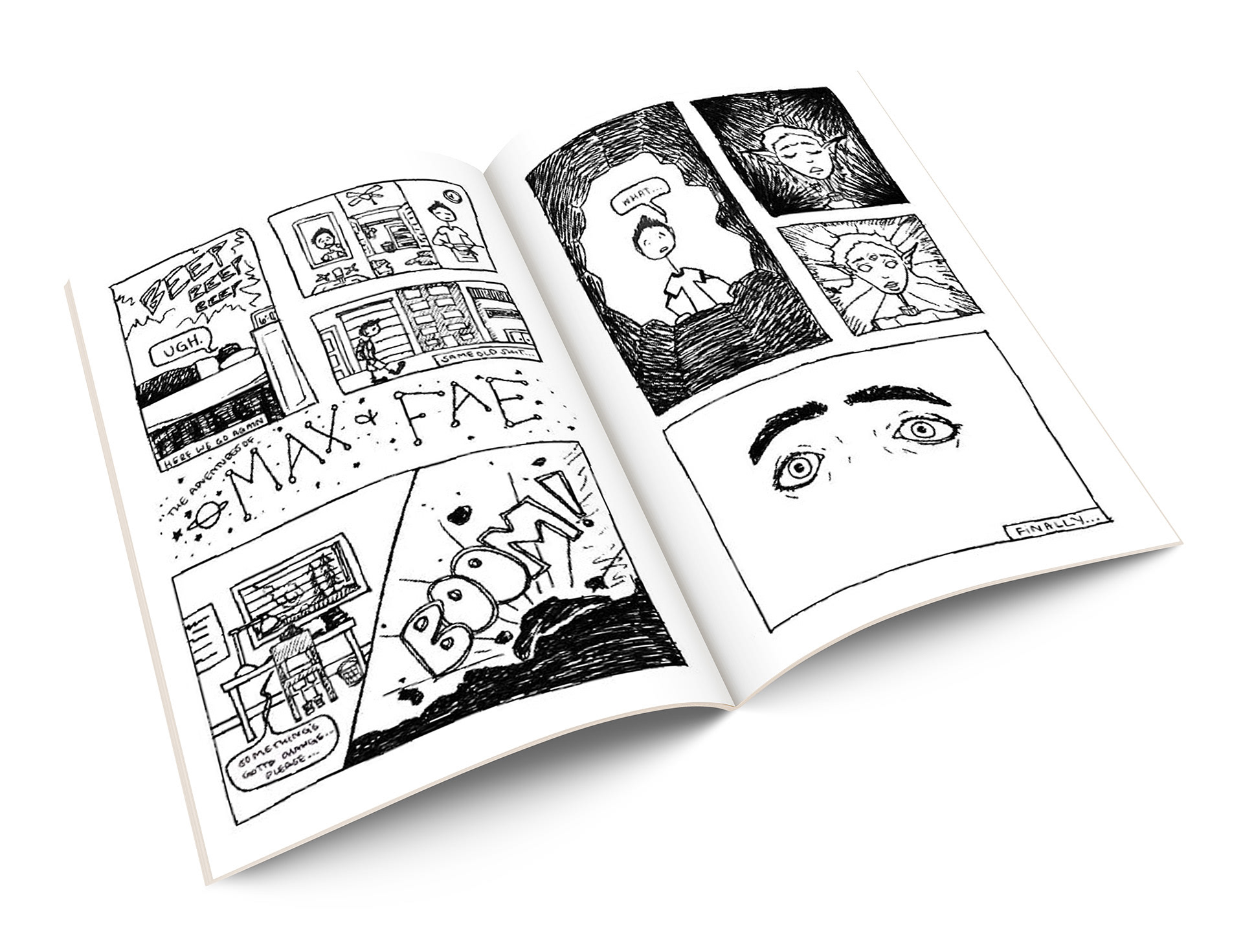
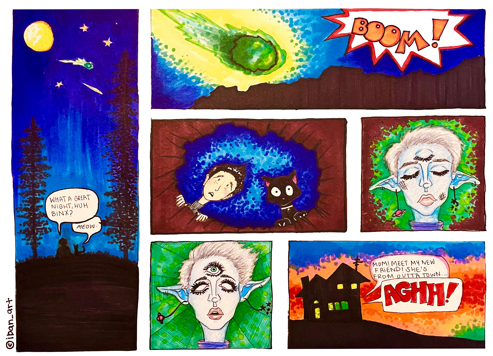
The zine narrative, The Adventures of Max and Fae, consists of two main characters, Max and Fae, but is primarily shown from Max’s point of view. The graphic is about a boy who has slowly become exhausted by his repetitive and mundane daily life. In one of the panels, we see him defeated and begging for a change when suddenly, BOOM, Fae quite literally crash-lands into his life. Throughout the remainder of the comic, Fae is encapsulated and amazed by what Max has always considered “ordinary” and, in turn, Max is amazed at the things Fae has always considered ordinary in her life. In summary, the story is meant to focus on sharing experiences and perspectives, and being able to step out of one’s personal perspective in order to truly see the other.
The illustrative work in the comic has a complimentary balance of detail and simplicity throughout the panels and actively utilizes the noir theme to promote the “constellations typeface” in an engaging manner.