Designer’s note: This project was based on a hypothetical branding for the 2022 Ebertfest movie festival that takes place in Champaign, Illinois.
RESEARCH
The project started off with research not only on the history of Ebertfest and the current screenings for that upcoming year but on the history of where the festival takes place as well. Ebertfest was founded in 1999 by American film critic and historian Roger Ebert. The festival was created to recognize films that were overlooked or underappreciated during their initial runtimes. In other words, Ebertfest was created with the intent of giving films and their filmmakers a “well-deserved second look”. The annual festival takes place every April and features twelve films over a period of five days; the films are selected from a list that was cultivated by the late Ebert in his fifteen years of the festival. However, other films not on the predetermined list also make an appearance based on a series of criteria outlined by Ebert and selected by the festival’s co-founder, Chaz Ebert, and the festival director, Nate Kohn.
BRANDING
The festival took place in the Virginia Theatre in Champaign, Illinois. The theatre itself opened in the 20’s (December of 1921) as a movie palace and has since served as a community staple-piece. With Ebertfest taking place in the Virginia Theatre, and the theatre’s 100th anniversary coming up, I felt it to be fitting and a unique design perspective to center my branding in an Art Deco, roaring 20’s atmosphere.
A lot of my research going in the direction of the roaring 20’s and Art Deco came from moodboards I found on Pinterest and Behance. I also looked into media surrounding the 20’s such as Baz Luhrmann’s The Great Gatsby as well as Lana Del Rey’s Honeymoon album.
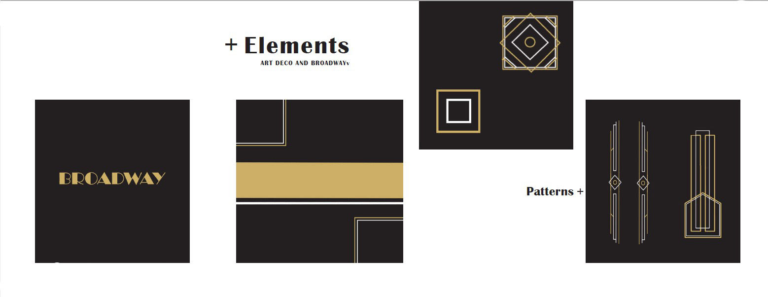
Repetitive elements I found from the direction I decided to approach revolved around a bold and elegant color palette (white, blacks, golds) as well as typefaces such as Broadway, Britannic Bold (primaries) and Century Gothic (secondary). The patterns that were incorporated into my Ebertfest branding were designs I made in Illustrator that I attributed to designs and posters I found from previous inspiration on Behance and Pinterest and are majorly gold geometric shapes with white accents.

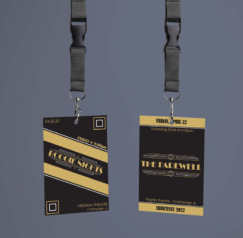
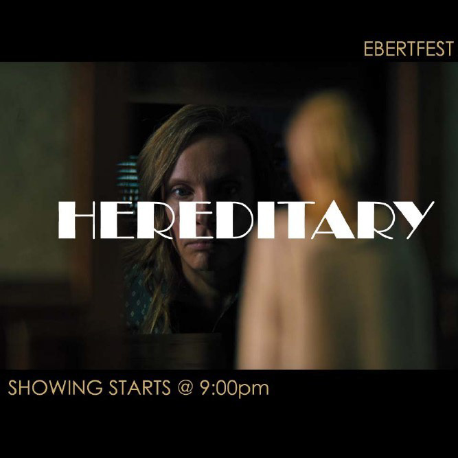
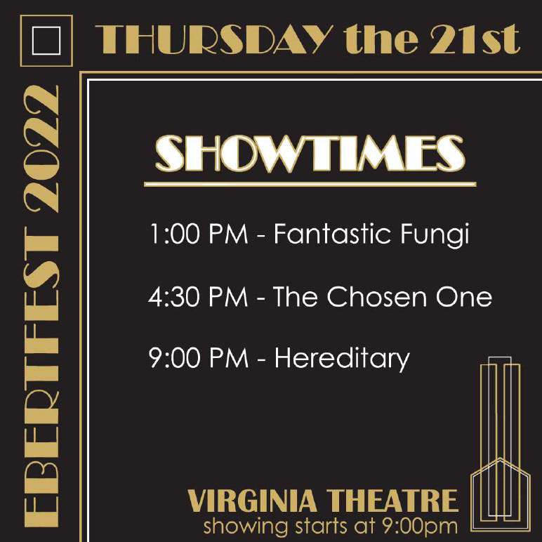
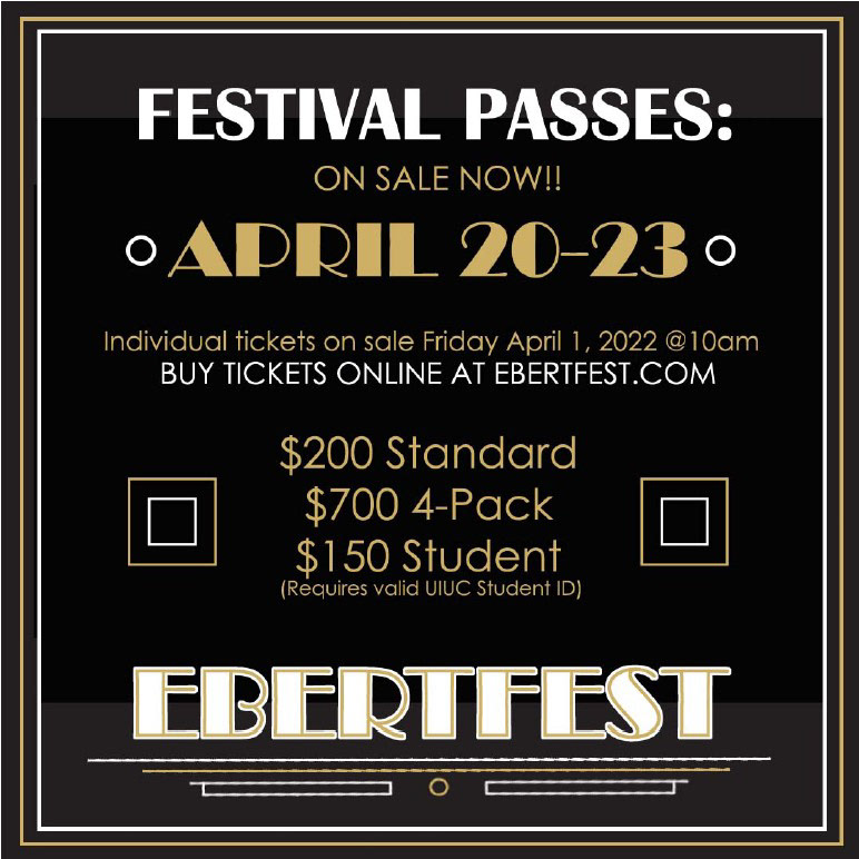
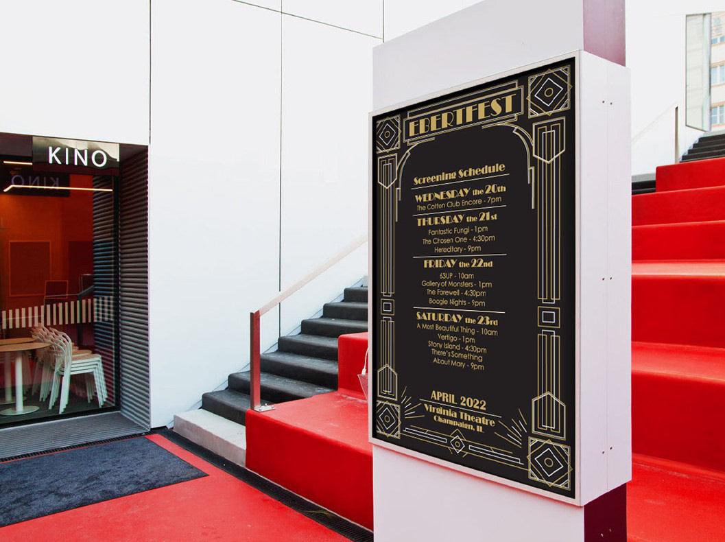
ASSETS (Badges and Instagram posts)
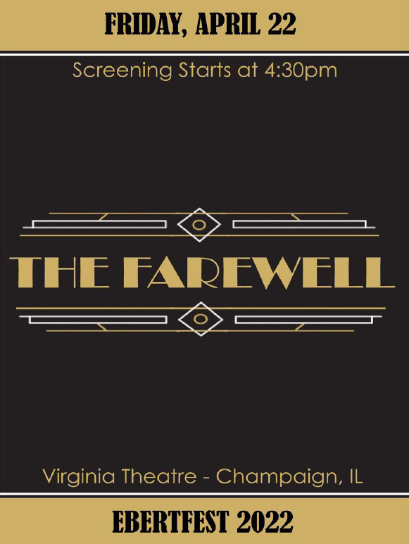
Other deliverables and elements include entry badges and promotional posts for Instagram, all in which coincide and compliment the main element, the poster.
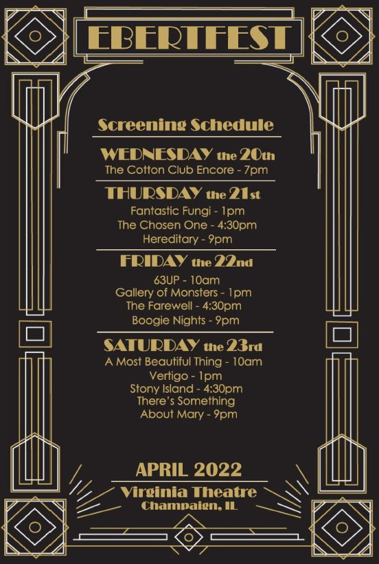
POSTER DESIGN
As for my poster design, Art Deco embellishments were a staple piece that accompanied roaring 20’s inspired text, specifically Broadway as a typeface.